This semester, I’ve challenged myself by completely throwing out my workflow and starting again.
Sounds drastic, doesn’t it? In many ways, though, it was the next logical step; I had gone as far as I could with my self-taught method and knew what gaps I had in my knowledge was where all of my remaining problems were coming from. Rather than consistently having to revisit digital negative after digital negative to clear up exposure issues, I wanted to streamline the process by learning how to make the perfect digital negative to start off with. I wanted to get “WYSIWYG” quality (What You See Is What You Get) out of my printed images: I should be able to digitally edit them to where I want them and my output, after printing the Van Dyke, should resemble my initial image – almost perfectly. My current workflow wouldn’t allow that – it required endless tweaking.
There was also several other paths I wanted to explore; testing new papers, mixing my own solutions, questioning my UV exposure times and methods along with my processing methods… my process definitely needed refinement. Although there are, no doubt, very fine instructors through AAU’s program that know and work with historical photo processes, there’s not, at least to my knowledge, a dedicated VDB printer that I could partner with – so I sought out a professional outside of the school to work with me through a semester-long mentoring program. In early July, I sent an email to Christina Z. Anderson to ask if she’d be interested in participating in such an adventure – and over the next two months, things were settled and, since late August, we’ve been working through completely refining my workflow.
The first thing that we threw out was my digital negative creation method – replacing it with a very rigorous, dedicated and scientific process, the Mark Nelson Precision Digital Negative method. There’s one heck of a learning curve with this process, a $75 system that comes with a lengthy instruction manual, printable charts, Excel spreadsheets … you name it… it was completely different than any system I’d ever worked in or read about. It took several weeks of setup, test stripping, refining, several missteps and restarts until I started to work with a completely calibrated curve – which, then, was tweaked for several weeks until I found one that worked magic for my negatives with the right amount of detail in the shadows and highlights. Thus far this semester, I’ve been able to really get this process down, completely revise my printing and processing methods, start testing other styles of paper along with mixing my own chemicals. It’s been an absolutely wonderful experience, but it’s been a lot of work, extremely stressful and, at times, the utter lack of progress has been very disheartening.
This lack of progress is some of the reason why I haven’t shared till now. This last weekend, after having several weeks of chemical issues and printing mishaps, I finally found my “groove” again and spent seven hours in the darkroom printing away, determined to have a lot of gorgeous prints to share. These are, by far, some of the best prints I’ve printed in my two and a half years of printing Van Dyke Brown.
Rather than spend the semester both trying to revise my complete workflow and shoot new material, I’ve focused most of my efforts on just revising the workflow. This will leave both spring and the early part of summer to fill in the gaps in my project before I present my Thesis sometime next summer. It’s been nice to do it this way, because many of the technical issues I’ve been carrying around like some old baggage has been because I’ve never had the time to focus on what’s wrong – I just kept on moving ahead. That said, this semester is by no means a rest or reprieve; I’m working the same, if not much more, than I was when I was shooting and printing all semester long.
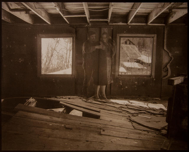
Out of all the images presented here, the one above is the only one that has any glaring technical errors that need to be cleaned up – and for eight VDBs, that’s quite an improvement from semesters’ past. What this also has allowed me to do is to reach back into the past and pull images out that I had previously ignored or eliminated from my series because of printing difficulty. I’ve gained back several images that I had reluctantly thrown away – and so, by refining my printing method, I’ve also greatly added to the potential images I can pull a series from.
Even images that I was perfectly happy with months ago seem dull, dead, grainy and muddy – and this is all because now I know how *good* a print *can* look – and my schedule allows me the added benefit of refining my prints as I go along rather than taking what I can get on a weekly basis and never having the time to clean up errors, variables and mistakes.
…perhaps “only one error” isn’t accurate – the above image has a slight tonal shift to magenta that I haven’t been able to effectively explain. That said, these subtle shifts between images used to be much more dramatic and were nothing that I could control. Now, with my workflow under control, I see any major shift in tones as a problem with my chemicals or my process – something that can be diagnosed and appropriately fixed.
The last image is a new addition to my series – an image taken about a month and a half ago during a fun trip to two local mines with two wonderful models and the visiting Snedden Chair at UAF Journalism. This image is a great example of something that I couldn’t do without my revised workflow – details in both the highlights AND the shadows – and no actual loss of any detail anywhere. I’m really pleased by the quality of this image but, overall, I’m very excited that so many images have the same exact overall tone to them – meaning that these could easily be the last prints I make of these images prior to my Thesis Defense.
As always, comments, questions and critique are always welcome. Thank you for taking time to look at my work!
Thanks, Wes! Your kind words mean a lot to me – I’m very happy with the quality of these images as well! I’ll have more to share, hopefully, soon!
First of all, I love what you are doing with the artifacts. before they seemed too sterile, this gives them a roughed up look that I think adds a lot to the story. second I really enjoy the tones you have working in these images. As you know, I love heavy contrast, but since these images wont have true blacks and whites by the nature of VDBs I think going with a wider range of grays really pulls the details in and makes the image more fun to look at. They are very busy images, but this is because there is detail in the shadows and highlights. This is a good thing as it keeps the eyes moving and searching for those little pops of detail that make these images exciting. Great work, can’t wait to see more!