Since getting back from APIS (Alternative Photography International Symposium) 2013 in Santa Fe this year, I’ve had my nose to the grindstone, practically reprinting my entire portfolio of Thesis imagery. Over the last two months, I’ve printed probably two dozen different prints (not counting multiples of individual prints), started mixing my own Van Dyke chemistry, ran several rounds of testing on a bunch of different papers and worked with archiving and toning my prints. This meant that the last two months were filled with a bevy of test strips, color charts, tonal palettes, Excel Spreadsheets and data entry. That said, I feel that I can say – with some confidence – that I know what I’m doing now with Mark Nelson’s Precision Digital Negative Method. Once again, my prints look better than they ever have – they have a great range of contrast, are exposed and edited appropriately to print within Van Dyke’s narrow range of tones and are consistently of the same exact warm tone.
The images I’m sharing with you were, predominantly, shot and constructed during the Spring of this year – but, in my effort to get my entire portfolio up to snuff for my upcoming Final Review, I’ve reprinted nearly everything I shot this spring, while adding a couple images along the way. This shot is a great example of the tonal flexibility that the new digital negative system I’m using allows – I have detail in my shadows and extreme highlights – all with the same exposure and no further digital negative tweaks! With this system, although very technically-demanding and extremely involved, once a curve is established, the darkroom frustration is completely eliminated – as prints just print well.
A huge thanks to Greg Culley for his help as a model in the above shot; he spent his own money to fly up all the way from Juneau to help me with my finals this last Spring. I can’t ask for a better friend and a better model!
Perhaps a little on the simple side, this is one of my favorite compositions – I like the texture-rich quality of the background that the ore collection tag is laying on and, as well, I love how much detail resides in the scene shot. Even though I’ve always been able to get good detail out of this shot (and I’ve consistently used it as a model for the rest of my shots), this one blows the others out of the water.
This image has consistently been one of the most frustrating images to print, prior to my use of Nelson’s PDN method. Between the subtle details in the interior shadows and the brightness of the exterior scene coupled with the fragile tonality of the interior snow, it was near impossible to get everything to come out right. I had actually abandoned this image because it infuriated me so much that I couldn’t get the quality that I wanted, even though it remains one of my favorite images. Thankfully, I’ve finally got a great print of it!
Thanks to Wes Schaefer for his help on this awe-inspiring trek; were it not for him staying in Alaska after his wonderful wife left the state for a job down south, I would’ve never created this image.
As with all the pairs here, this diptych pairs with the above apparition shot and is intended to give contextual reference and a piece of the miner’s stories to the remnants. These slices of Alaska’s mining history are little-known and fading fast – what remains rarely means anything to the adventuring soul that happens upon it in the woods. It is my hope that my images here will give a story to those remnants, so that they can be seen for more than just merely the sum of their parts.
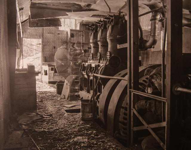
99% of the time, all my apparition shots are constructed digitally from two to five separate medium format negatives, collecting individual poses of multiple models within the same scene. This was an experiment late last spring to see if I could bring in a digital image into a film original with a model shot in a completely different location. Anyone want to take a guess as to who is the on-site model and who isn’t? Can you tell? Does it matter? In many ways, it does – at least to me. Although these apparitions I’m creating may not be completely authentic, in that they’re simply based on generalized archetypes of a specific era and NOT specific people, I do want my experience photographing these scenes to be as authentic as possible – so I want to always shoot my models on-site to ensure scene blending. This remains my only exception to that rule.
A discarded 1930s-1940s hat and an advertisement for a 1950s automobile – paired with what is, perhaps, the most obscenely colored kitchen I’ve ever seen. Although many miners chose to live in little more than the basic one-room cabin, those that could afford to build a house for their Lower-48 families would lure their wives up with promises to provide all the amenities of the Lower 48. These now overgrown rustic “mansions” are completely at odds with the frigid exteriors and remote locales. This one, in particular, had a rustic exterior of log yet was a full two story home with root cellar, seven different shades and designs of wallpaper and, as the home was re-purposed through the boom-and-bust cycle of the town, eventually also sported seven different colors of… shag carpet…
Enjoy – and, as always, critique and comments are welcomed. Feel free to share, as well!
+There are no comments
Add yours