
Now that the early spring in Alaska has reduced my snowy landscapes to mud and muskeg, I’ve switched my focus from my series of arctic landscapes, entitled Skookum, to focusing on developing Emblem and Artifice further. Last year, I talked about the process of letting go and accepting serendipity while developing images for this series and, admittedly, I found that many of the initial images came relatively easy. First printing attempts with any given symbol were often quite successful and I considered making this part of the series – that not only would each image be a unique print but that it would be the first (and only) attempt at creating with that particular symbol.
Almost as soon as I conjured up that intriguing conceptual caveat, I hit the brick wall. The process stopped working with me (or I stopped working well with the process) and I started creating a pile of duds – images that either were far too hard to read or prints that didn’t match the tonality and hues represented in the rest of the series. These new images didn’t simply add a healthy dose of variety to the series – they fell flat, were often confusing, and didn’t have the same magic as before.
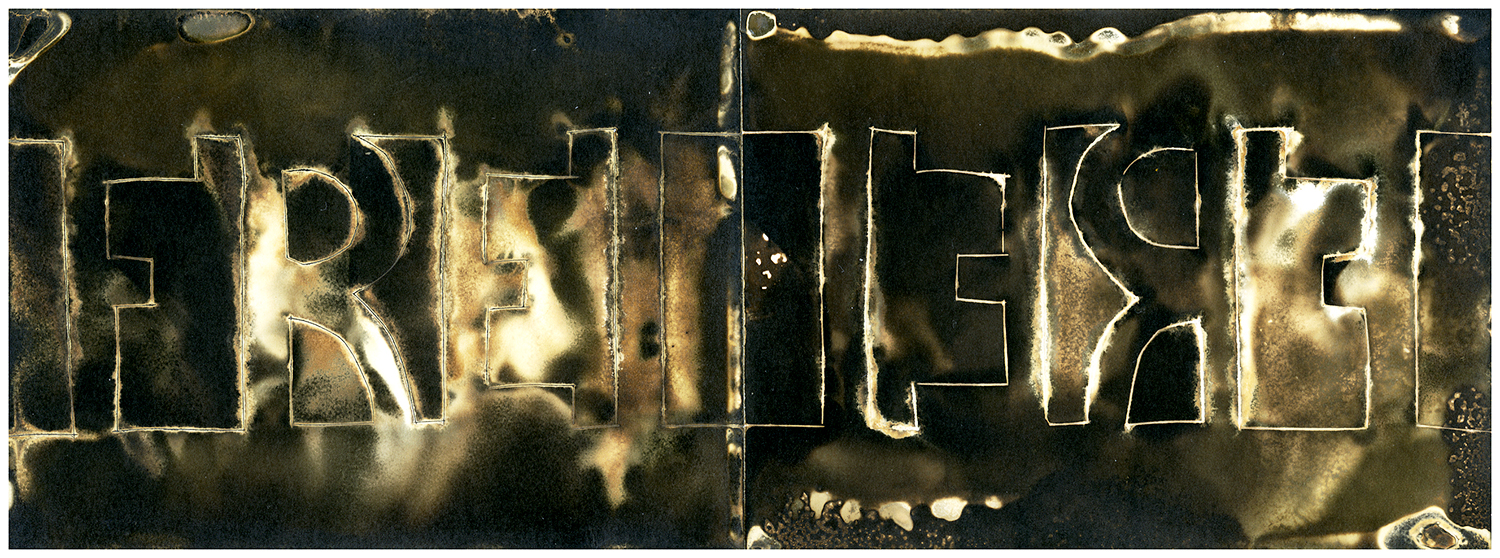
Originally, I had embraced the Chemigram process on this paper because the resulting image echoed a decaying piece of metal – which matched up well with my intent to paint these symbols as forgotten icons of another time. These new images certainly did that – but so much so that it was difficult to recognize what the original symbol was.
In an attempt to cultivate variety in series imagery, I started to consider altering how I represented the images between the two diptych prints. Rather than just a mere copy or a mirror image, I considered spanning a single symbol between two pieces. These options allowed me to explore more, but the images were becoming even harder to read. On top of it, I started realizing how important it was going to be to design a procedure of sorts – something to control what results I was getting. Symbols drawn free-handed resulted in jagged rounded edges and misaligned diptych sets.
Tonality issues and shifts in hue also started cropping up. These images no longer looked like the images I was creating early on – they were sloppy, unreadable and unrefined. I knew these images couldn’t work in the series even before I showed it to several artist friends I have that are helping me edit down this series.
So… what of serendipity? Those early images seemed to have come so easily – as if both happenstance and I were working in concert. Had that moment passed? Was my experiment dead in the water?
Thankfully, rather than accepting failure, my deep-seated stubbornness kept me going. I decided to start refining my method, eliminating variables that were causing everything from hue shifts to poor coating in the resist. I started utilizing paper stencils to transfer my symbols to the paper, making sure that a second or third attempt at printing would be done with the same quality as the first. I started learning more about which chemical did what to the print – and moving my print at the right time. This last one was perhaps most important – it meant that I started looking at the serendipity scientifically – learning to expect a result rather than be surprised.
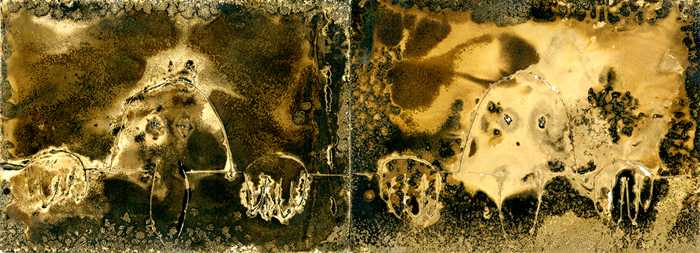
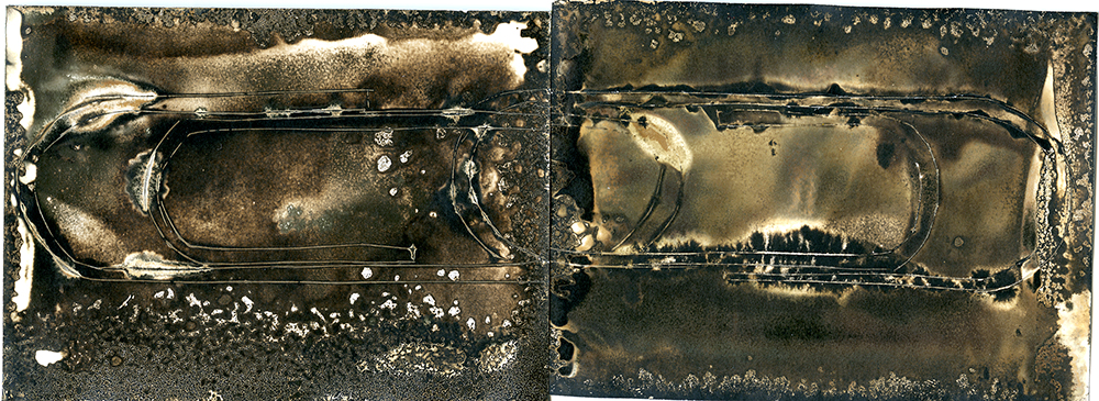
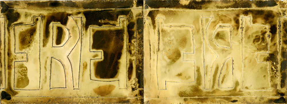
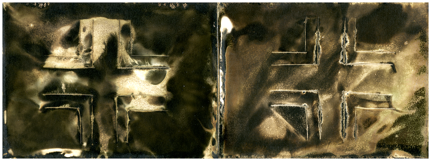
Almost instantly, my prints started working again:
I had originally started creating with Chemigrams as a way to break free of the rigid working method I’d created for Stories Fading Fast, enjoying how beauty seemed to be a product of letting go. After creating these over the course of the last year, I’ve realized that to be successful in creating these images, I still have to be willing to steer the project gently to any number of surprising endings. Although unimportant to the viewer, this project has become less about letting go and more about knowing when to let go.
Expect more prints in the coming weeks.
+There are no comments
Add yours