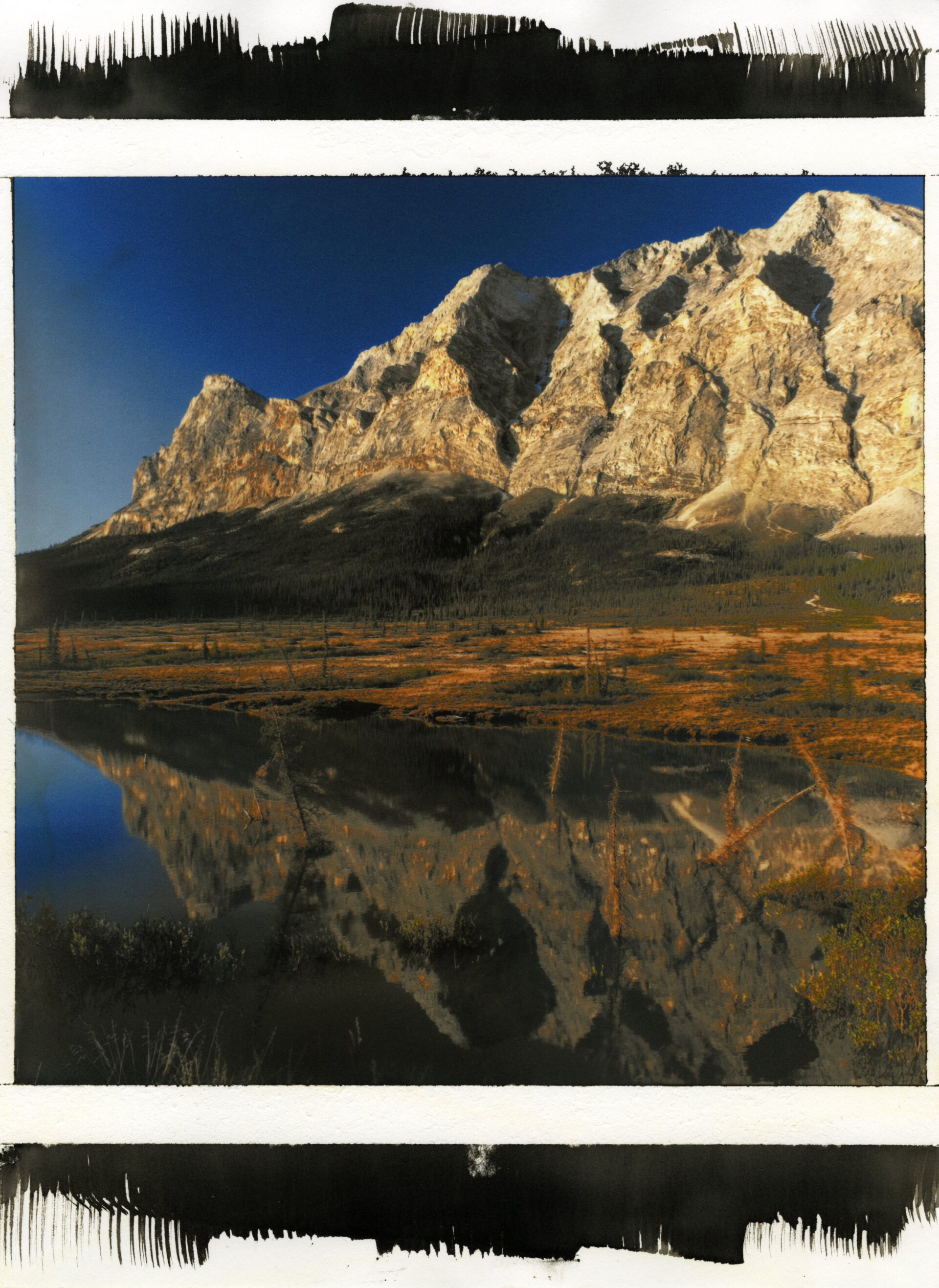
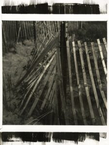
 While on my 17,000-mile roadtrip during 2025, I attended my first workshop at Anderson Ranch, a week-long, intensive photography workshop on Platinum-Palladium Printing over Pigment. This experience was incredibly rewarding, spiritually refilling and artistically fulfilling, opening my eyes to a new fusion alternative process that married digital capture with analog creation. From my initial dabblings in alternative process early on in my graduate studies back in 2010/2011, I’ve always been searching for ways to bring more tangible and personal connection to the digital work I create by finding a way to funnel it into the darkroom, but, by and large, most of my work in the following fifteen years has neatly fit into either darkroom/film-based projects or distinctly digital. Sure, my thesis work, Stories Fading Fast, fuse the two capture methods into one, and some of my random, one-off creative challenges have used analog process as an alternative way to express my Road(Side)Trip images, but my mainline projects, Western Consumption and Resilient are siloed off, one distinctly full analog, darkroom and alternative process, and the other, respectively, digital-only.
A side note for those that are paying attention to my language use there: you can see the pride I take in my Mordançage work for its unique, hands-on, and distinctly analog approach versus my purely digital work. It’s not prejudice against digital, I swear, but… how do I say this: if there’s a less-known path, a long route that’s neglected, a more strenuous approach? I’m the first one to pull on the nitrile gloves and apron up, so to speak.
 Standing in opposition to this voracious appetite for alternative process is the practical frugality and meager opportunities created by my geographic isolation in Alaska. While my graduate studies at the Academy of Art University instilled a deep passion for continuing education through workshops, conference attendance, and networking, both Santa Fe and Maine Media are practically on the other side of the continent. Covid certainly impacted workshop opportunities for years. Workshop opportunities also seemed to have dried up quite a bit on the West Coast. I’ve also spent much of the last 15 years exploring a broader and broader range of self-taught alternative processes, but my explorations into full-color altpro has been met with some sizable stumbling blocks. I know – there’s an entire family of color processes out there to explore, but many I’m uncomfortable with exploring without professional mentoring and the one I did attempt to learn (gum bichromate) turned me off for a variety of reasons.
Then there’s Platinum-Palladium over Inkjet Pigment. My week-long tutelage under Morgan Post in 2025 introduced me to an incredibly accessible, full-color alternative process that was frankly so straight-forward that it embarrassed me that I had avoided Platinum for so long, blindly assuming that the cost of the process was somehow reflected in how complex it must be. Or, perhaps, the cost alone just made it feel off-limits to me. Either way, I came out of that workshop wondering why I ever spent so much time trying to rein in and harness the potential of the often-ignored and always frustrating Van Dyke Brown process when Platinum prints came out so similar, with so much more tonal range, and so easily that it, honestly, feels like I’m somehow cheating. Sure, there is the cost to consider; there was no way that my adjunct wages and entry-level staff position  would have paid for thousands of dollars of supplies for Pt/Pd over years of my (already incredibly expensive) graduate study program. VDB’s affordability made me quaintly stubborn – I was going to, come hell or high water, make this process work for me. During my time at AAU, I exhausted (known) resources at the university in alt, desperate to make my work better. After all, typical instruction manuals for the process don’t cover appropriate washing cycles, effective coating methods, fixer exhaustion, or paper humidification in dry, desert-like environments – any introductory writeups make it sound like you can simply make VDB prints with the snap of your fingers, like they come out of an easy-bake oven. Not. so. My last year or so at AAU was spent under the extensive tutelage of Christina Z. Anderson, who influenced me the most in becoming the alternative photography photographer and instructor I am. Without her help, I would have been lost.
*Cough* ok, again – back to Platinum-Palladium. Morgan’s workshop introduced me to using Hahnemuhle’s Platinum Rag, mixing my own chemistry, controlling contrast and warmth through drop ratio, and reaffirmed the need to create actions to make digital negatives for classroom distribution. This necessarily streamlined the process by assigning a particular paper to use (and not wasting precious chemistry, time, and my ever-lessening hair on testing the process on incompatible papers), allowed a pre-formatted ICC profile to be used for the paper, and allowed already-created editing curves to be used. This made it practical for both a week-long workshop but also offered an alternative perspective on creativity in alt-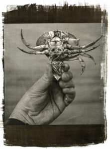 pro: you didn’t necessarily have to wade into the muck of step wedges, step tablets, curve creation, wash, rinse, repeat for each paper – you could just make with your hands. Full control and full choice with cyanotype, VDB, salt, or albumen makes sense because the chemistry is affordable – for Pt/Pd, having a more pre-tailored process lowers the entry fee significantly.
So significantly, in fact, that I decided to apply for a supply grant earlier this year, spend the summer and early fall investigating it, and bring it to my Handmade Photos course and teach it for (what I can only assume will be) the first time at UAF. With the grant awarded, I purchased the Platinum Rag, Fixxons OHP, and Bostick & Sullivan pre-made Na2 Pt/Pd kits and started diving into how to alter what I learned to bring it back into the classroom. B&S’s premade kits were a consolation of sorts for the classroom – although I was taught how to mix my own, pre-made drop mixtures were more practical for introductory alt students. Dredging up lessons from 2025’s workshop was hard because I’m terrible at taking notes, but I managed to make enough mistakes in the darkroom, forcing me to dive deeply into online forums, and clean up what mistakes I was making. Honestly, the mistakes that I made in preparing my demonstration for my alt-pro students provided more than ample examples for wide-eyed students to not make similar mistakes. What was perhaps the most effective lesson was breaking down the cost per print, including all the drops of chemistry, the Fixxons, and the Platinum Rag – not including the 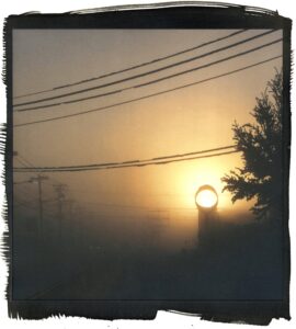 ink. Once students knew their prints were $8-10 mistakes, they paid attention, took notes, and were more careful than any other group of students I’ve ever seen.
What sort of mistakes did I make? Some pretty sophomoric ones in my enthusiasm to print and print quickly, but each failure provided an excellent, tangible example for students of what *not* to do.
- Humidifying paper and pre-wetting brushes is absolutely essential for this process. I know this from years of experience with Cyanotype and VDB and watching my print wash off paper because chemistry didn’t embed itself into the tooth of the paper. That doesn’t mean that I didn’t forget to either humidify my paper or pre-wet my brushes more than once and the failed examples drew gasps from the class practically.
- Center-weighted and square compositions seem to encourage accidental misalignment of the pigment color print and the platinum negative. Or maybe I’m merely excusing my rushed and sloppy process which produced a Pt/Pd print that was flipped from its pigment back print. Some students were keen to point out how “cool” the echoed / mirrored effect was, but it was a small consolation to what was otherwise a failed print.
- That one drop of B&S’s Na2 for most prints is no joke. One drop with an accidental second drop will fundamentally change what that resulting print will look like.
- If you do happen to use an extra drop, make sure you wash out your brush because even the residuals are enough to drastically alter the *next* print that you coat.
- My notes horribly incomplete, I failed to note that I needed to convert my images to CMYK prior to printing. Because of that, I had several quite favorable Pt/Pd over pigment images that came out looking perfectly fine – in fact, perhaps a little uncanny – with the image printed as an RGB base. Some images work very well in RGB, however ones with greens *have* to be printed in CMYK. This is more of an observation as a suggestion because every online resource states that they must be printed in CMYK.
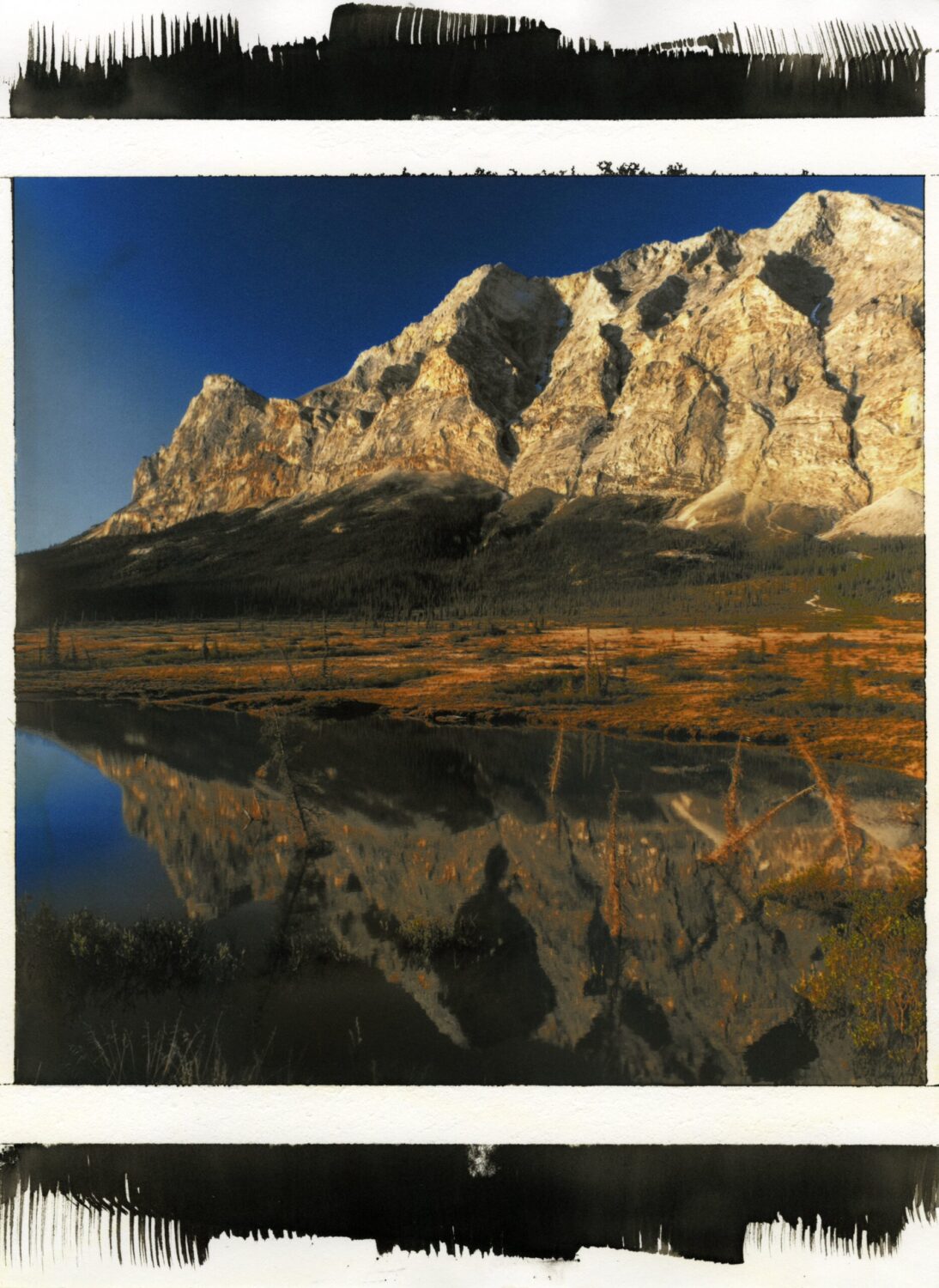
These were all great lessons and have thoroughly influenced my students to be much, much more careful printing with this wonderfully accessible yet still incredibly expensive photographic process. It has also encouraged many side discussions on finding “your” alt-pro process – not just the process that appeals to you visually the most, but the one that you’re also most likely to use after the class. In a unit worth of material that had me presenting Cyanotype, Van Dyke Brown, a slew of Cyanotype Toning options, as well as Platinum Palladium Printing and Pt/Pd over Pigment, I was impressed how many students chose to use more affordable processes for their projects even though our awarded grant would have paid for their materials if Pt/Pd was chosen. After three dozen prints (or more!) created by my students, they absolutely love this process, but have mindfully chosen a process that fits better with their working method.
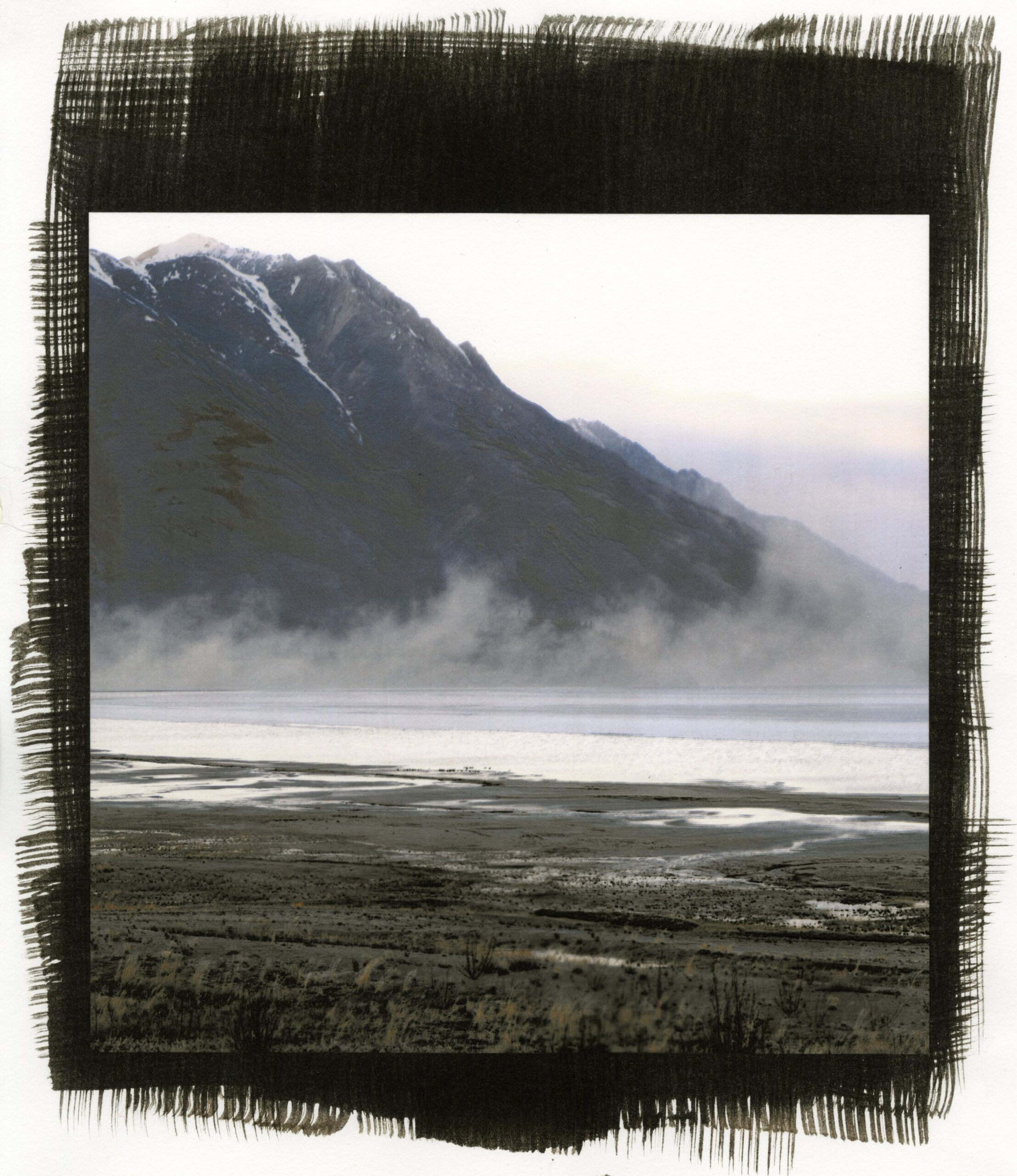
I, on the other hand, think I’ve found the process that might translate my digital-only work into the handmade, analog sphere. As I move toward the thirteenth year (!!!) of photographing lonely Alaska landscapes for Resilient and question whether shoulder seasons and more dramatic color doesn’t have a place in this ever-evolving project, I am also wondering whether all these images wouldn’t more accurately reflect me and the project’s intent with a more handmade, intentional and analog solution.
+There are no comments
Add yours